linktree
media kit
2026
design strategy
product design
design systems
visual design
branding
about✐
As the design lead on this project, I spearheaded the 0-to-1 UX strategy for Linktree’s Media Kit, transforming fragmented creator metrics into an authenticated "proof of influence." I owned the end-to-end experience—from the creator management editor to the public profile. To balance brand transparency with creator privacy, I established a "positive framing" data hierarchy that securely visualizes commerce performance and acts as a custom-branded creator media profile to share with brands and agencies.
the problem
There's no reliable way to prove a creator's influence actually works — so deals get made on guesswork instead of evidence.
↳
The opportunity
↳
Linktree sits at the moment where influence becomes intent — the click. No other platform has first-party cross-platform data at this scale, combined with commerce attribution.
users & needs
primary
Creators
Doing everything by hand — Canva decks, social media screenshots of their insights — and still feeling like their pitch didn't reflect the quality of their content. The problem wasn't a lack of effort—they just didn't have the right tools.
secondary
Agency partners
Confirmed they ran into the same challenge — showcasing a roster of creators through one centralized, professional media kit was still a manual, fragmented process. And beyond the kit itself, they were still chasing additional data: click conversions and sales that their existing tools couldn't surface.
tertiary
Influencer managers
Validated that evaluation was broken on their end too — inconsistent, self-reported metrics and too much time spent verifying stats. They wanted a standardized, trusted artifact. Verified first-party data was named unprompted.
The same gap surfaced across all three groups: social stats alone aren't enough, and no existing tool bridges the moment between content and conversion. Linktree's first-party data was the missing layer.
core design tension
The central challenge wasn't visual — it was trust architecture. How do you give creators control over their story without compromising the credibility of the evidence?
↳
Creator Control
↳
Brand Trust
↳
Creators need to tailor their pitch — hiding irrelevant sections, spotlighting case studies, adding context. Without flexibility, adoption fails.
↳
Brands won't act on data they don't believe. Any hint of editability on verified metrics undermines the trustworthiness of the media kit.
data architecture
Five tiers of evidence, ordered by signal strength. Creators control the story. Linktree controls the evidence — verified sections are read-only, with a tooltip education layer explaining every metric to brands and creators alike.
Audience demographics
tier 1
Follower count, age, gender, location. Answers "is this the right audience for my brand?" Verified via social authorization.
Audience action

Linktree first party data
tier 2
CTR, click-through depth, repeat engagement. Linktree's proprietary signal and the most defensible proof of intent.
Brand collaborations
tier 3
Self-reported partnerships, past work examples, press. Creator-authored, clearly labeled as such.
Social context
tier 4
Follower count, engagement rate, posting frequency across platforms. Used for context, not primary proof.
media kit profile
media kit editor
Reflection
The most interesting design problem here wasn't visual hierarchy — it was the credibility architecture. Media Kit's value proposition is entirely dependent on that "Verified by Linktree" badge establishing trust and being an up-to-date source of truth.
That shaped every design decision: the limited customization of each section, the explicit sourcing of each data tier, the deliberate separation between creator-authored content and system-generated evidence. Getting creators to trust a product that limits their control required being very clear about why those limits exist — and who they benefit.
tinder
gold home
2024
design strategy
product design
design systems
visual design
branding
about✐
The Gold Home page is a core screen in Tinder's main navigation that allows non-subscribers to view potential matches they can instantly match with via Tinder Gold. Additionally, it serves as a high-touch surface for our subscribers to match with users that have already liked them.
The page has underperformed for subscription conversion and has seen less matches for our subscribers.
✄impact
Gold Home has repeatedly been Tinder's most impactful surfaces for retention and conversion. This project was an opportunity to redefine the UX for two of Tinder's most important target personas: Non-subscribers and female users.
With respect to brand identity, revenue, and our most important KPI — matches — my team and I were able to re-establish a core Tinder experience for our users.
current gold home experience
fully launched
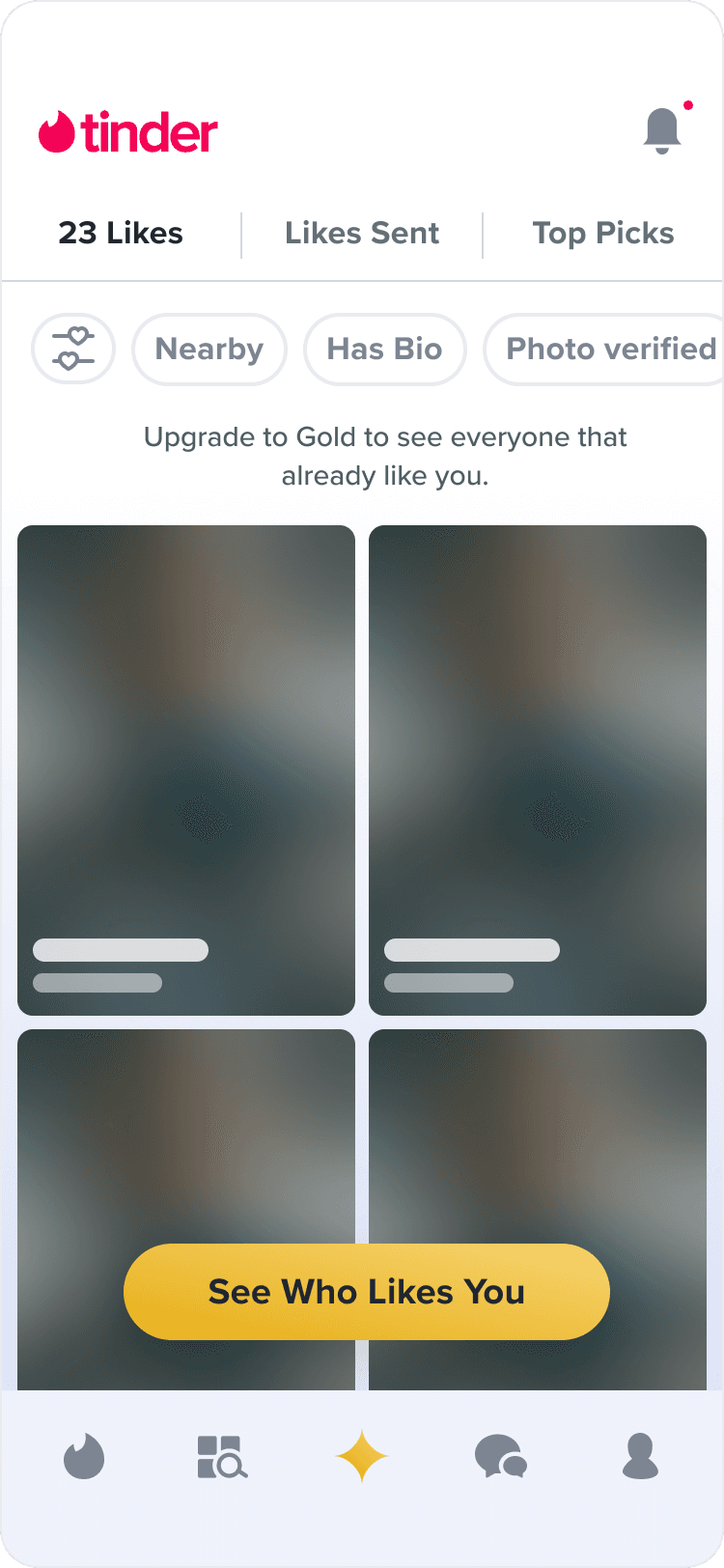
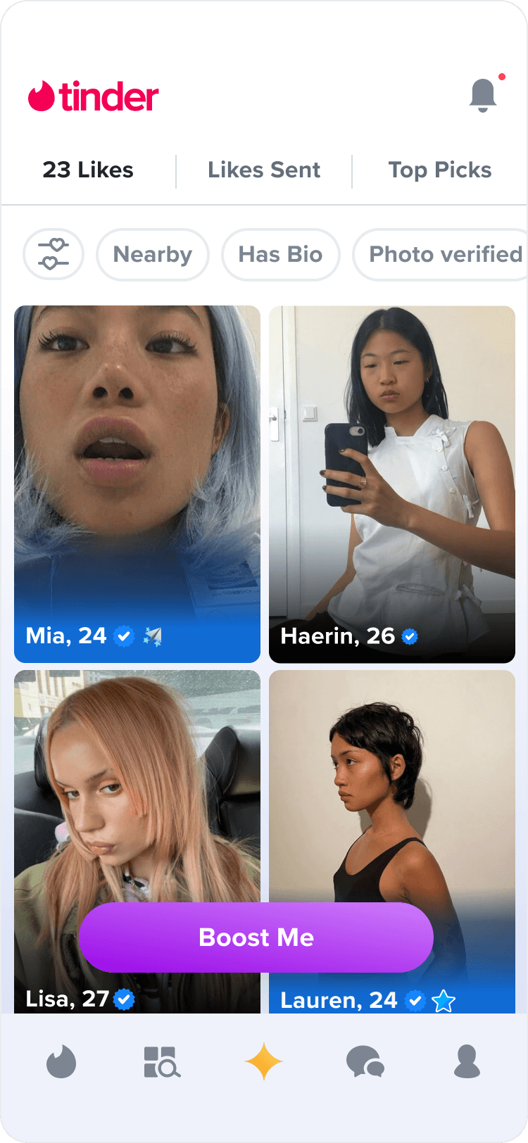
The current Gold Home is a passive, utility focused feed that displays a stagnant grid of profiles.
A
non-subscriber
This became a low-performing page with little incentive for free users to subscribe.
B
subscriber
For subscribers, this grid of profiles is a collection of low-quality matches without any organization or emphasis on high-quality matches.
A
non-subscriber
B
subscriber
the solution
Adding a revealed Likes section in Gold Home can emphasize high quality profiles and encourage subscription conversion and retention.
↳
For our subscribers
↳
For our non-subscribers
↳
Improving the engagement of the Gold Home page through dynamic and contextualized content can add value to our subscription services.
↳
By revealing high quality profiles to free users, there is more incentive to subscribe in order to match instantly.
fig 02;design proposal
current non-subcriber likes you page
fully launched
A
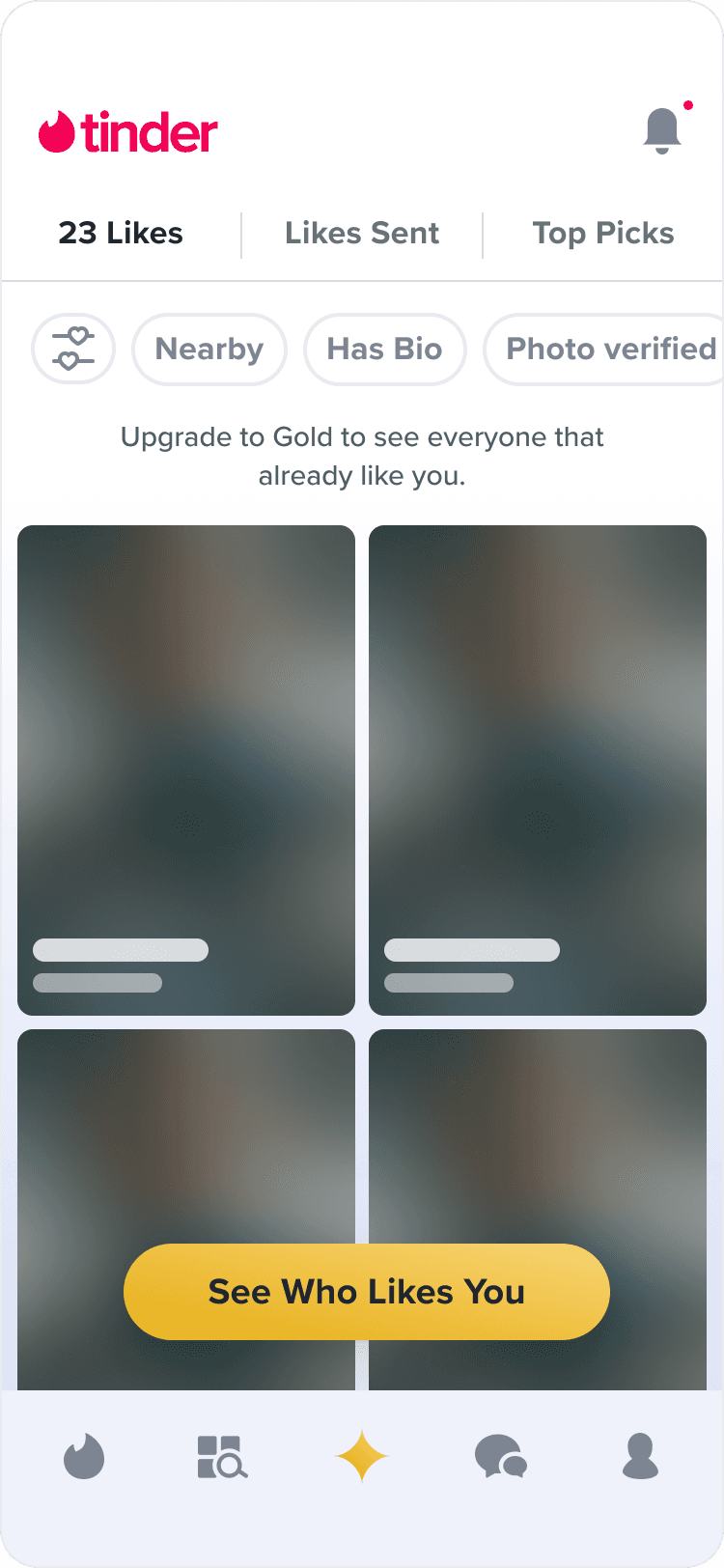
The current non-sub experience is a collection of blurred profiles that have Liked you.
B
This view may not provide enough incentive for users to unlock Tinder Gold since the blurred profiles are not enticing or indicative of the types of matches the user could be interested in.
proposed non-subscriber likes you page
proposed
A
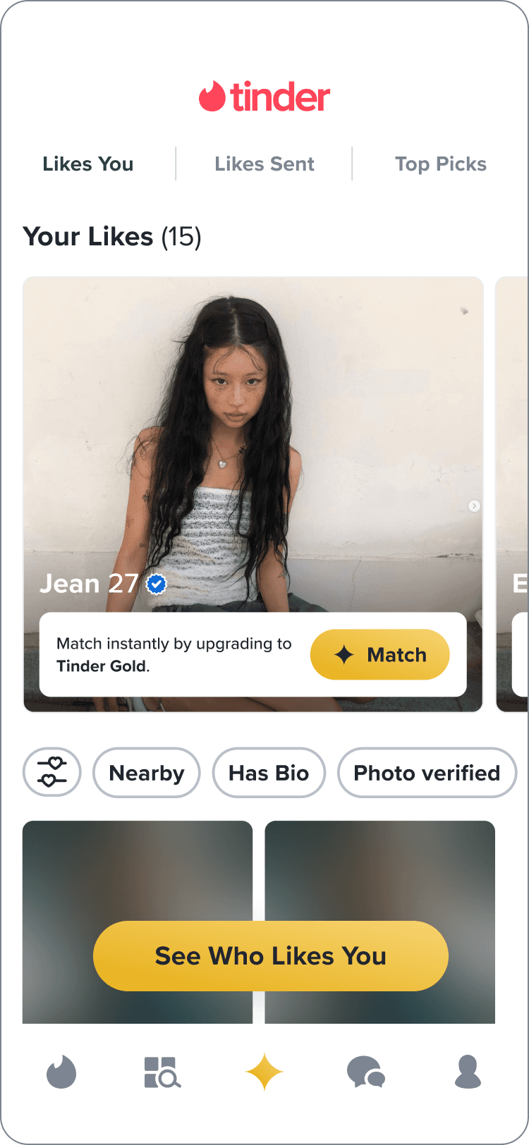
The revealed likes section highlights the top 3 profiles that have Liked you (sorted by popularity).
B
These profiles will be unblurred, but users cannot Match instantly without subscribing.
C
By showing high quality profiles, users are more likely to upgrade and match instantly.
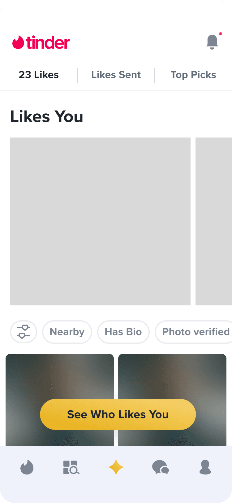
fig 03;layout explorations
↪ For the first round of design feedback, I presented three different layout options for the revealed likes section of the Gold Home page.
direction 1
1
Flippable card stack of profiles
direction 2
2
Carousel of profiles with UI that matches the rec stack
direction 3
3
Carousel of profiles with UI that doesn't resemble the rec stack
direction 1
feedback
+
Highlights individual profiles well.
+
Could be an ideal layout for subscribers since it indicates that you can swipe left/right on the profile — just like on the rec stack.
-
Doesn't scale for the non-subscriber state because non-paying members will not be able to swipe left/right on the profiles. This means they won't have visibility on the rest of the card stack.
direction 2
feedback
+
Feels the most straightforward when it comes to navigating between the profiles for both free and premium users.
+
UI closely matches the rec stack.
-
Horizontal carousels usually don’t perform well based on Norman Nielsen UX practices.
-
Gradient overlay over photo feels more cluttered.
direction 3
feedback
+
“There’s something refreshing about bringing in a lighter banner at the bottom of this module. It opens up the space even though we are adding to it.”
+
The layout of the cards look different from the more familiar gradient design of the rec stack, indicating that these profiles are "special" because they've already liked you.
↪ I also presented two different options for the button design that will be shown on each profile of the revealed likes section.

+
-
-

+
+
-
revealed likes carousel
final designs
Layout
The final designs were a result of identifying and incorporating the highest performing elements of each iteration. Ultimately combining the most successful carousel and upsell banner explorations.
Button
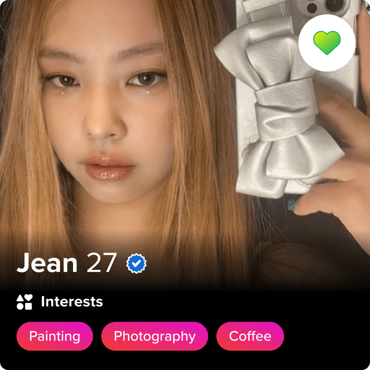
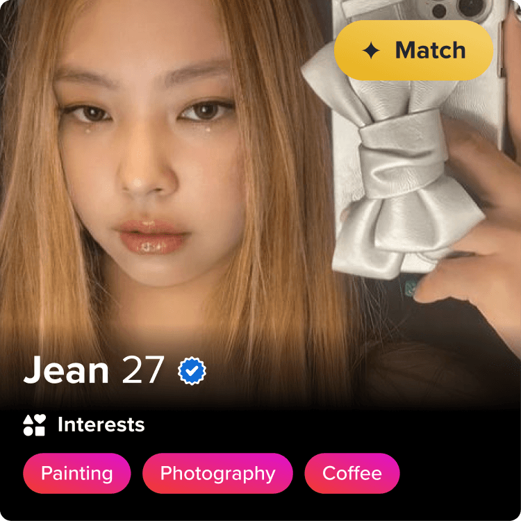
The CTA uses the same iconography and color as the Tinder Gold branding to indicate that this button is more powerful than sending a like.
The explainer text next to the CTA indicates that clicking “Match” will open a paywall.
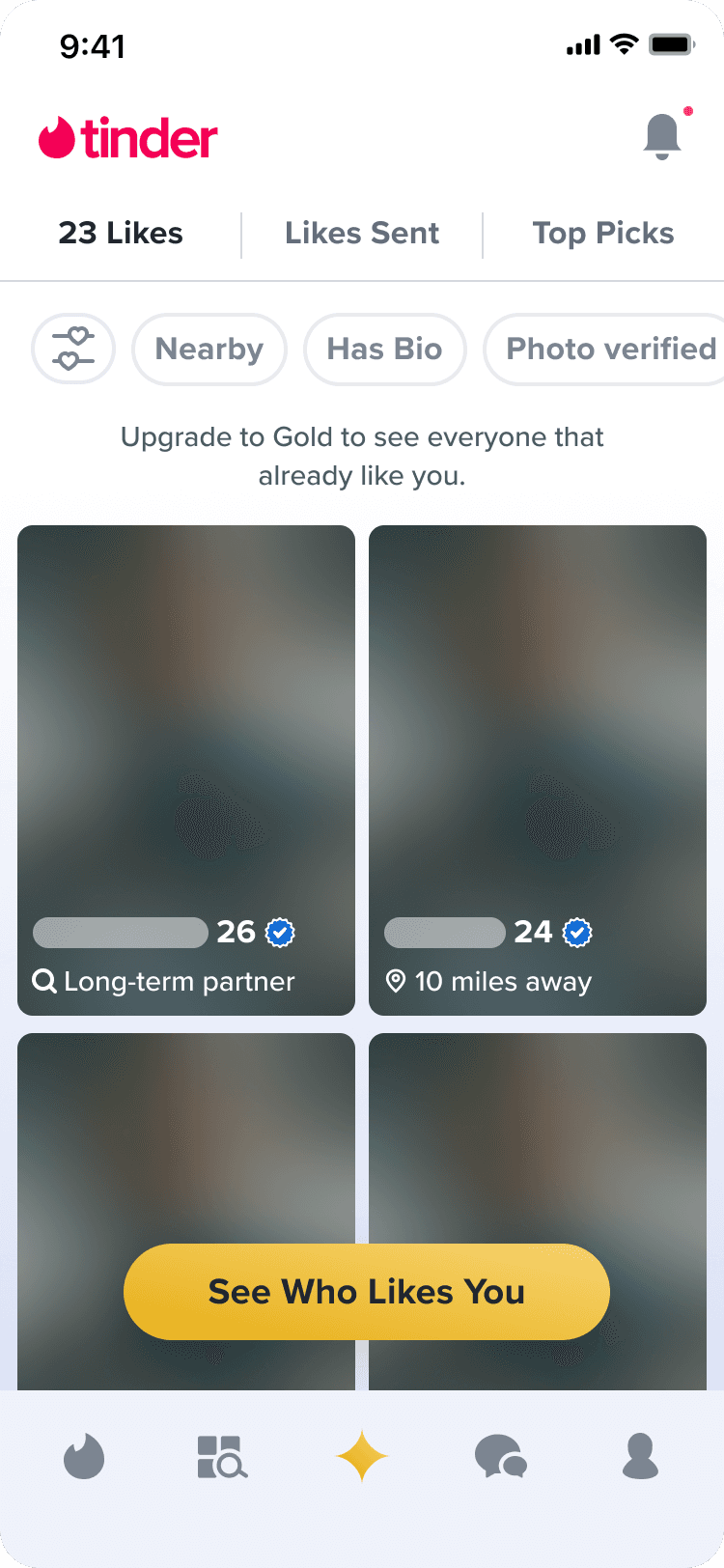
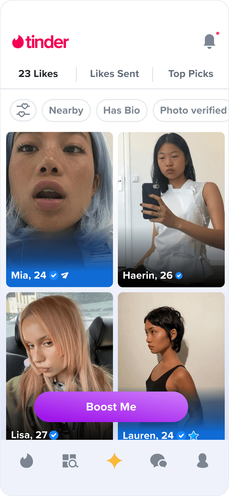
With the profiles on Gold Home, we also wanted to show 'green flags' for each user that has sent a like.
A
non-subscriber
Green flags provide incentives for users to upgrade regardless of the blurred photos.
B
subscriber
For subscribers, the exposed green flag provides more organization to the repetitive grid of profiles. It can increase efficiency for finding new matches and provide more user value to the subscription.
before (non-sub)
after (non-sub)
before (sub)
after (sub)
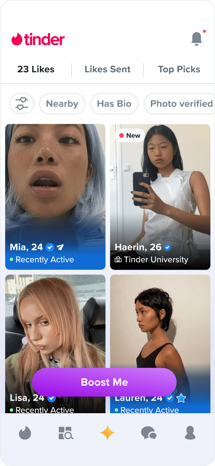
fig 06;project KPIs
Subscription Conversion
Subscription Retention
Paywall Views
Gold Home visits
Matches
tinder
dynamic paywalls
2021 - present
design strategy
product design
design systems
about✐
Dynamic Paywalls is on ongoing takeover of all ALC and subscription paywalls within Tinder. Paywalls across the platform's experience haven't been updated since 2015, and since then, the brand design language has changed significantly as well as how users interact with different types of modals/paywalls.
✄impact
My role as the leading designer on this project allowed me to redefine the visual language and user interactions of all revenue experiences across the board. Also, my work with creating dynamic and reusable components has allowed for flexibility in designing, building, and testing all new forms of paywalls.
fig 01;existing paywalls
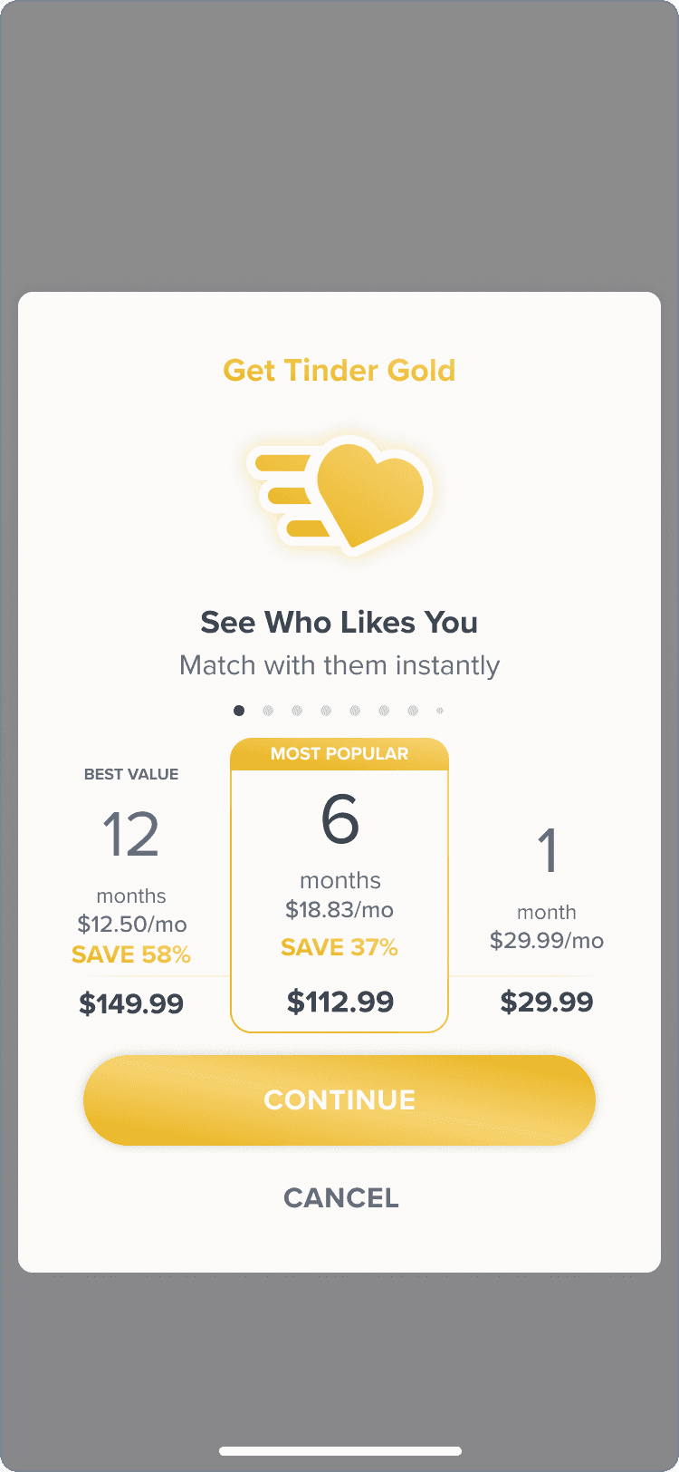
↪ The existing Tinder paywalls have inconsistent layouts across different products (a-la-cart / in-app currency / subscription paywalls) and across different platforms (android / ios / web). This is because each paywall is hard-coded and the individual components are not reusable, creating irregularity across the different experiences.
subscription
a-la-carte
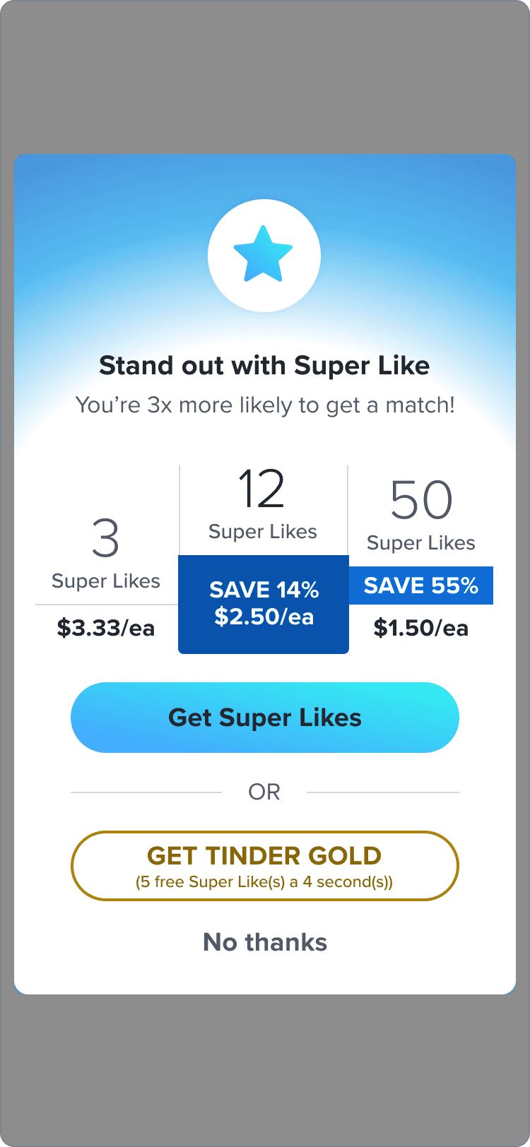
in-app currency

fig 02; paywall customization
↪ Existing paywalls are only optimized for price testing (highlighted in green), but the majority of the paywall contents are not customizable (highlighted in red). This makes the original paywalls Incapable of personalization across different users or countries with content.

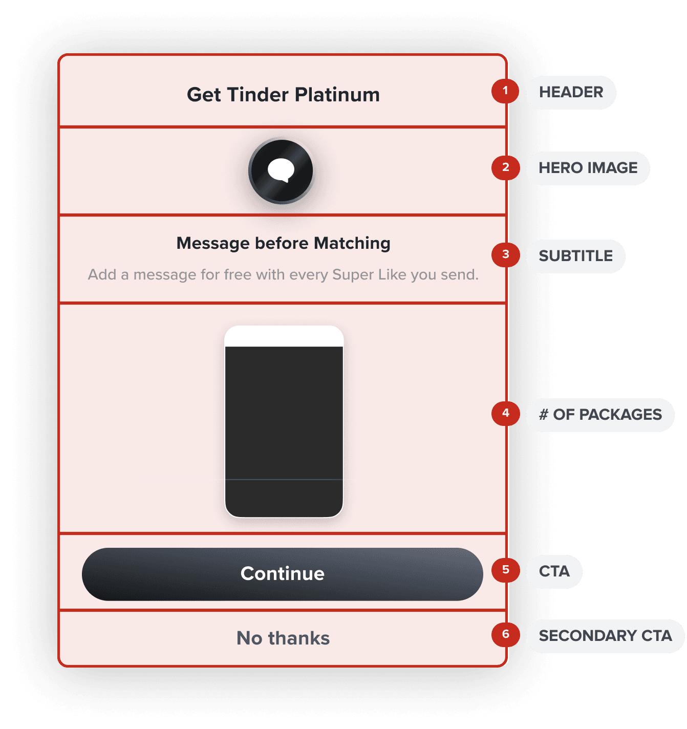
↳
Version 1.0
For the first milestone, we tested two layouts. The 3-SKU version has the same format as the current paywalls, while the carousel version introduces a new paywall layout.
3-SKU
3-SKU
-> No CTAs
-> Stacked SKUs
-> Aligns with current in-app paywalls
-> Upsells are always visible at the bottom
carousel
carousel
-> Clear CTAs
-> Focused SKUs
-> Flexible cards
-> More real estate for packages
research; version 1.0
↳
Version 1.0
research
Through an AB test, we saw that both options performed better than the existing paywall. Boost cash was up over 6.5% (stat sig), and total cash was up 0.6% (stat sig). Annualized, this is about an increase of $10MM.
Between the two, Boost cash increased significantly in the carousel view, as it sold more ‘5 Boost’ packages.
3-SKU
A
3-SKU Version Removing a CTA resulted in less conversion
carousel
B
Carousel Version Users weren’t scrolling through the carousel, so subscription cash was lower in the carousel version.
A
3-SKU
B
carousel
research; milestone 2
↳
Milestone 2
research
For our final and most impactful milestone, we conducted 3 rounds of qualitative user testing to iteratively come to our final designs.
Round 1
-> Moderated Usability Test
+
Round 2
-> Unmoderated message comprehension test
+
Round 3
-> Unmoderated usability test
=
Milestone 2 final designs
↳
Milestone 2
research
testing round 1/3 (results)
Overall, users didn’t communicate a preference between the two layouts, but majority needed more information about the subscription tiers in order to make a purchase.
A
3-SKU
->
Users liked being able to compare prices all in one screen.
->
Users preferred Tinder Platinum being displayed in an external paywall in order to keep the information separate.
B
carousel
->
The last card of the carousel was mistaken as a summary of all of the SKUs from the previous cards.
->
Swiping through each of the cards felt like high effort.
testing prototypes
A
3-SKU
B
carousel
↳
Milestone 2
research
testing round 2/3
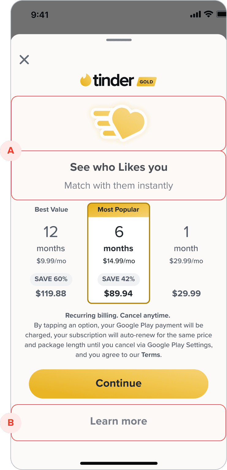
For the second round, we decided to test our existing paywall to understand the interactions with the contextual entry point in the header, the header image, and the functionality of the subscription tier comparison page.
A
Contextual entry point
Users weren't able to make the distinction that they were getting the Tinder Gold subscription, and thought they were just getting the individual feature mentioned in the header.
B
Learn More screen
The paywall and the 'Learn More' screen were analyzed in isolation, and users weren't able to make the connection between what they were purchasing and the list of features.
A
3-SKU
testing prototype
testing prototype
existing layout
↳
Milestone 2
research
testing round 3/3
Cumulating all of our insights from experiment data and user testing results, we identified two new versions that we hypothesize will lead to a better performing paywall.
testing prototypes
list
carousel
↳
Milestone 2
research
testing round 3/3 results
paywall
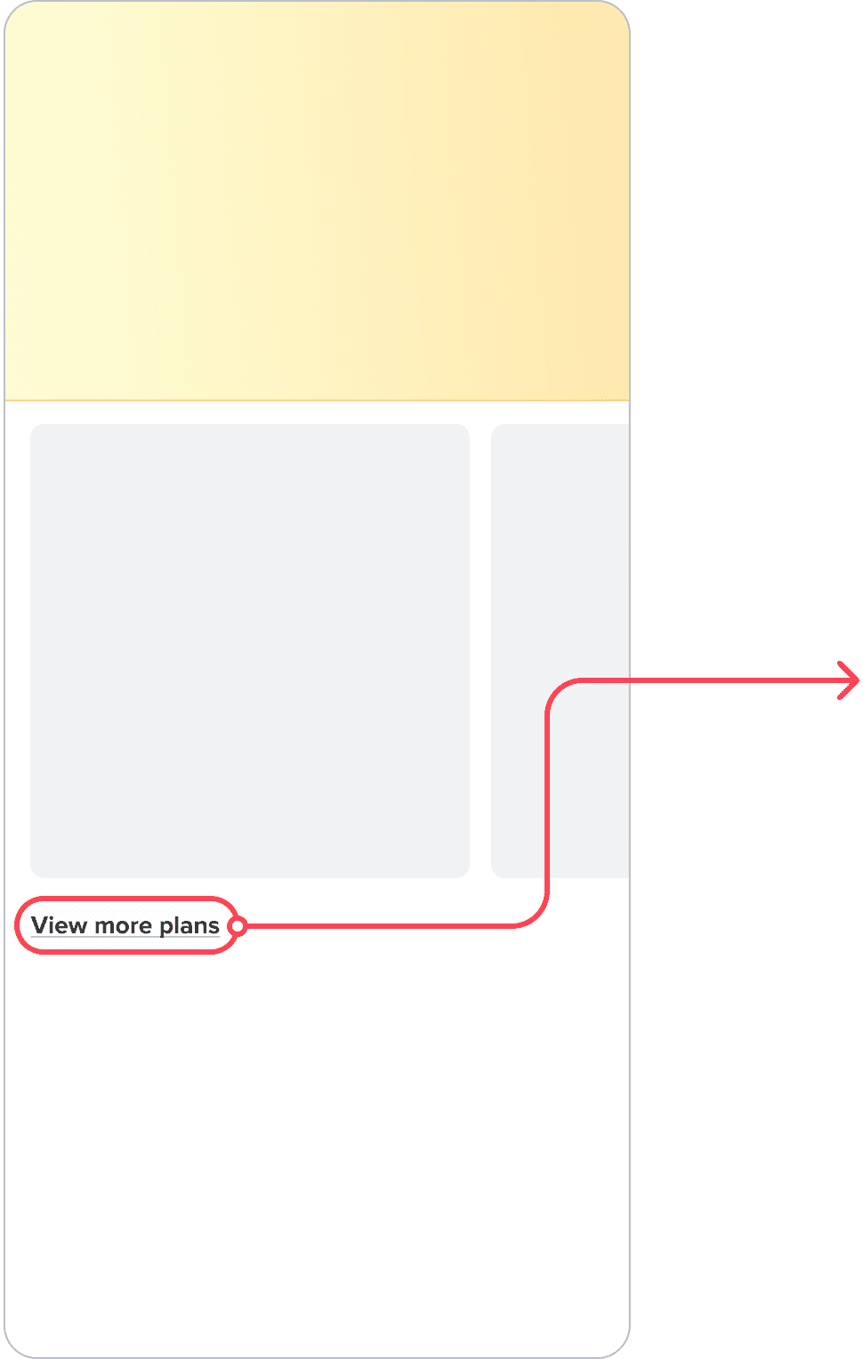
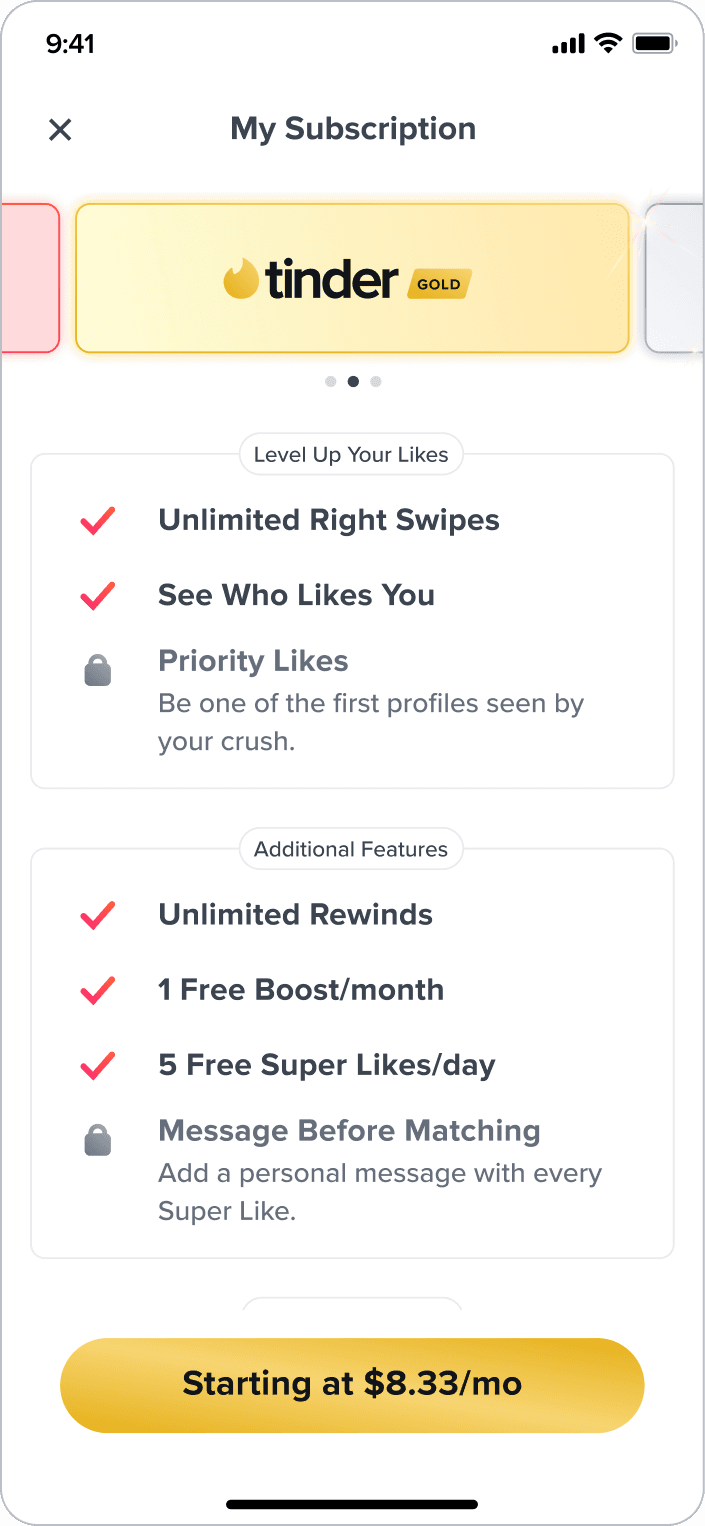
sub merch page
*
View more plans CTA No usability issues reported on the Sub Merch page, and all users were able to swipe between the offered plans. Overall, users enjoyed the addition of ‘View More Plans’.
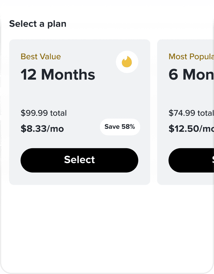
carousel
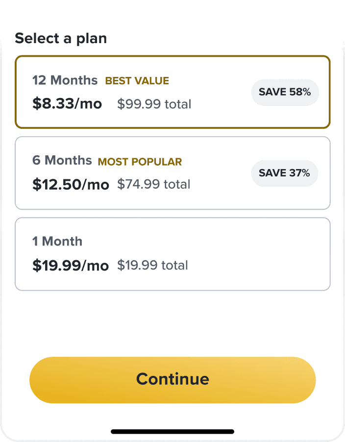
list
*
Carousel vs. List Most users were successfully able to swipe or toggle between options, locate the purchasing CTA and ultimately make the purchase for both layouts.
*
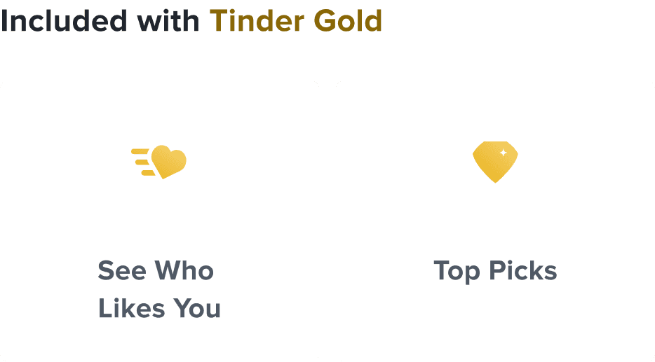
Feature List 4/10 users expected the tiles to be clickable and wanted more information about the individual features upon clicking on the tile.
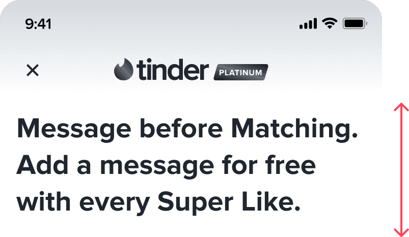

contextual header text
The feature in the header title changes depending on where the user encounters the paywall.
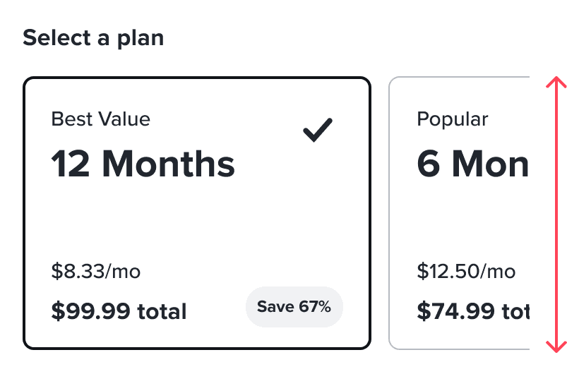

carousel layout
We chose the carousel layout for more flexibility for future iterations of subscription paywalls and adjusted sizing so users can compare the pricing of two SKUs at once.
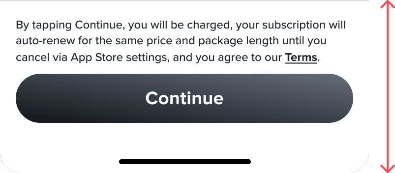
sticky cta
The CTA is fixed at the bottom to encourage the user to scroll lower and view the full list of subscription features.


feature list
Since this feature list has the same information as the subscription comparison page, we kept the styles between the two aligned. The original design from the user testing was using a tile-like display of the features, which was misleading to users because the content seemed clickable.
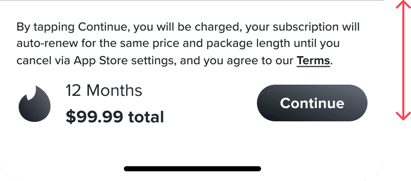
dynamic sticky scroll CTA
To prevent the need for users to recall their selection at the top, the sticky CTA is dynamic while scrolling and changes depending on what package the user has selected. It also reflects the total price to reduce cognitive load.
final designs
fig 03; implementation
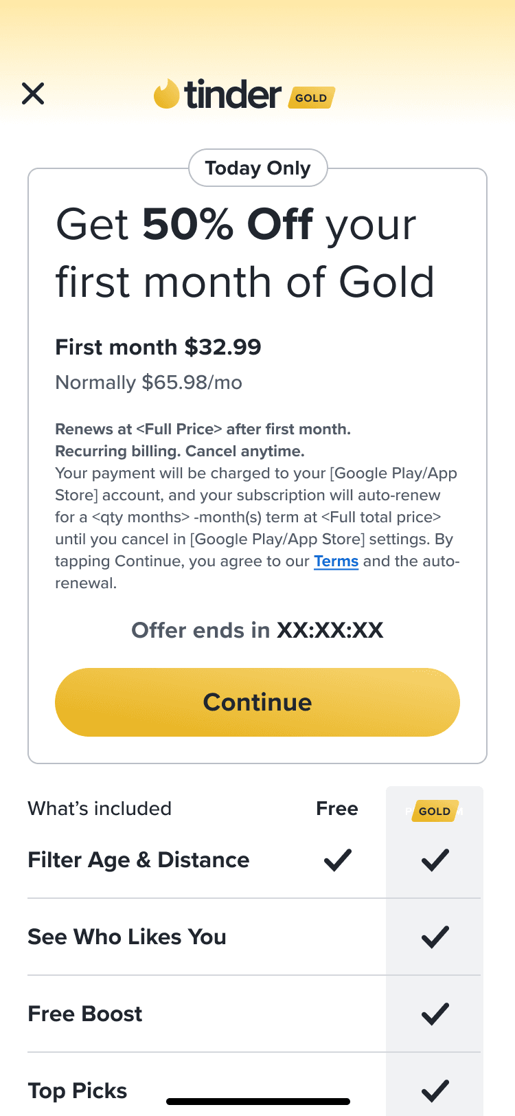
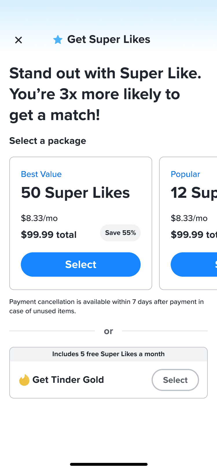
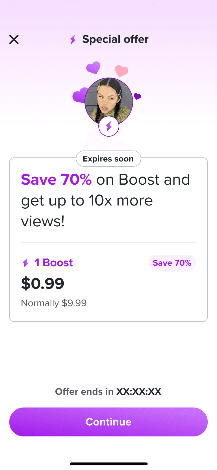
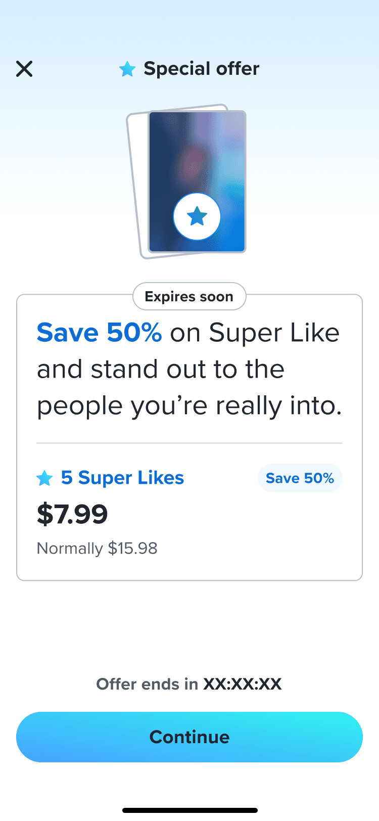
↪ Since this project, we've iterated on the dynamic paywall template to create 19+ new, unique paywalls that use the same components and styling. This demonstrates the impact as well as the scalability of the project, as every a-la-carte, subscription, and offer paywall has moved towards the dynamic paywall template. Since it's release, we continue to improve on the success of our paywalls as well as the alignment of the revenue experience across all features.


the future of paywalls
With Project Dynamic Paywalls, we can build a framework for future iterations of all in-app paywalls and define Tinder’s visual approach to revenue features.
↳
Componentized Paywall Elements
↳
Premium Branding
↳
Using componentized, reusable elements across our revenue paywalls increases alignment across designers and reduces workload for engineer implementation.
↳
Our updated paywalls aim to improve the premium user experience and visuals across the board to modernize the current Tinder revenue services in terms of usability and brand design.
tinder
brief project overview
2021 - present
about✐
As a product designer on the Growth and Revenue team, my projects revolve around optimizing revenue streams and curating a premium experience within Tinder. The revenue team works with technically complex domains, thinking systematically, and adapting to new insights or evolving requirements. For each of my projects, I'm able to work as the lead designer and have complete ownership.
revenue
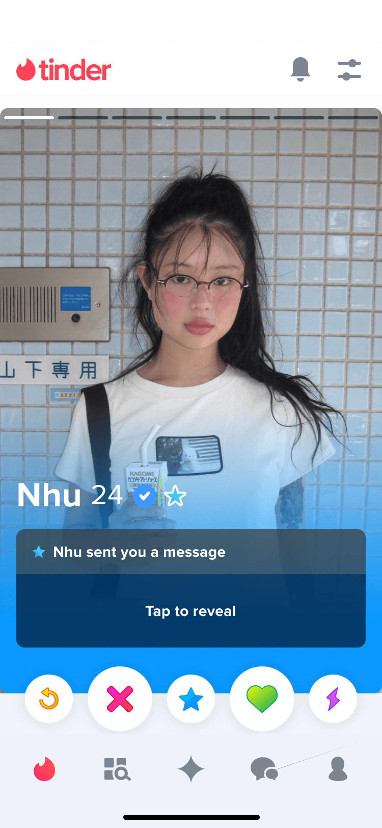
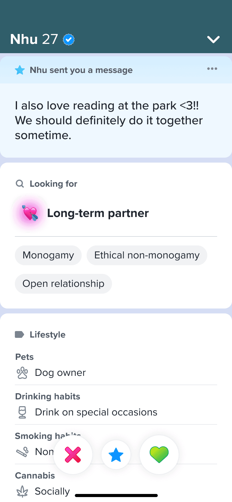
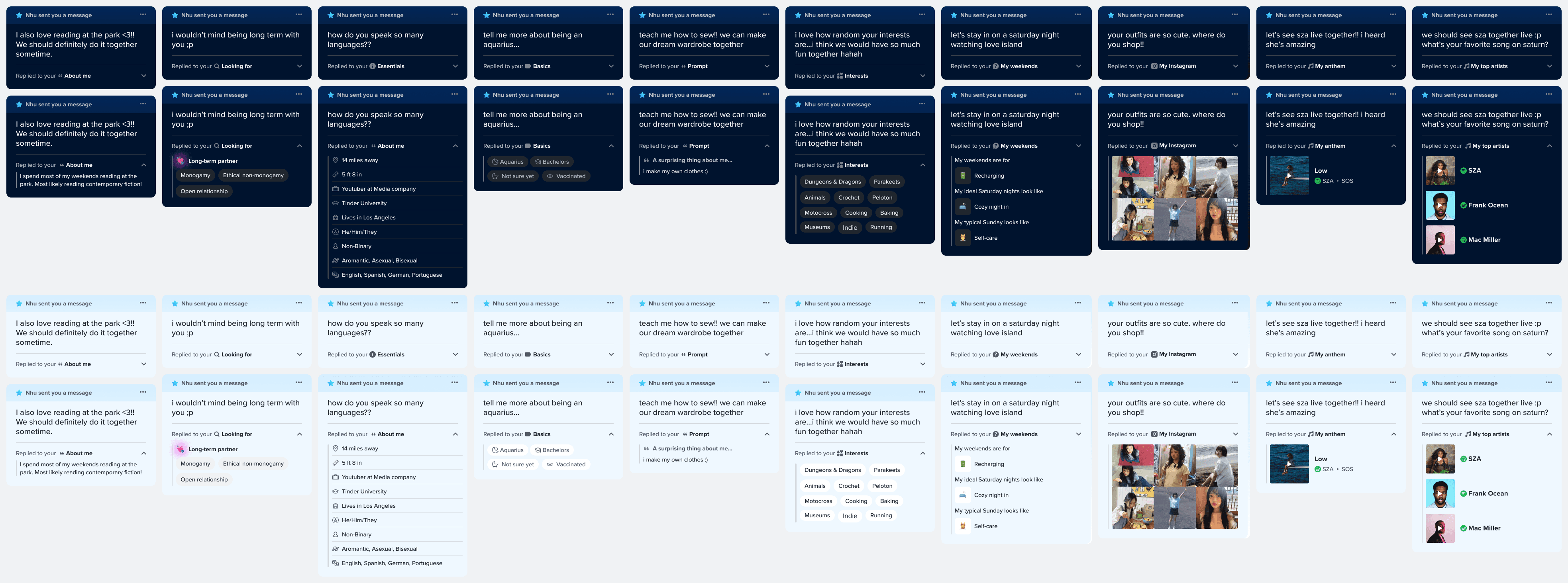
Swipe Note Redesign


growth
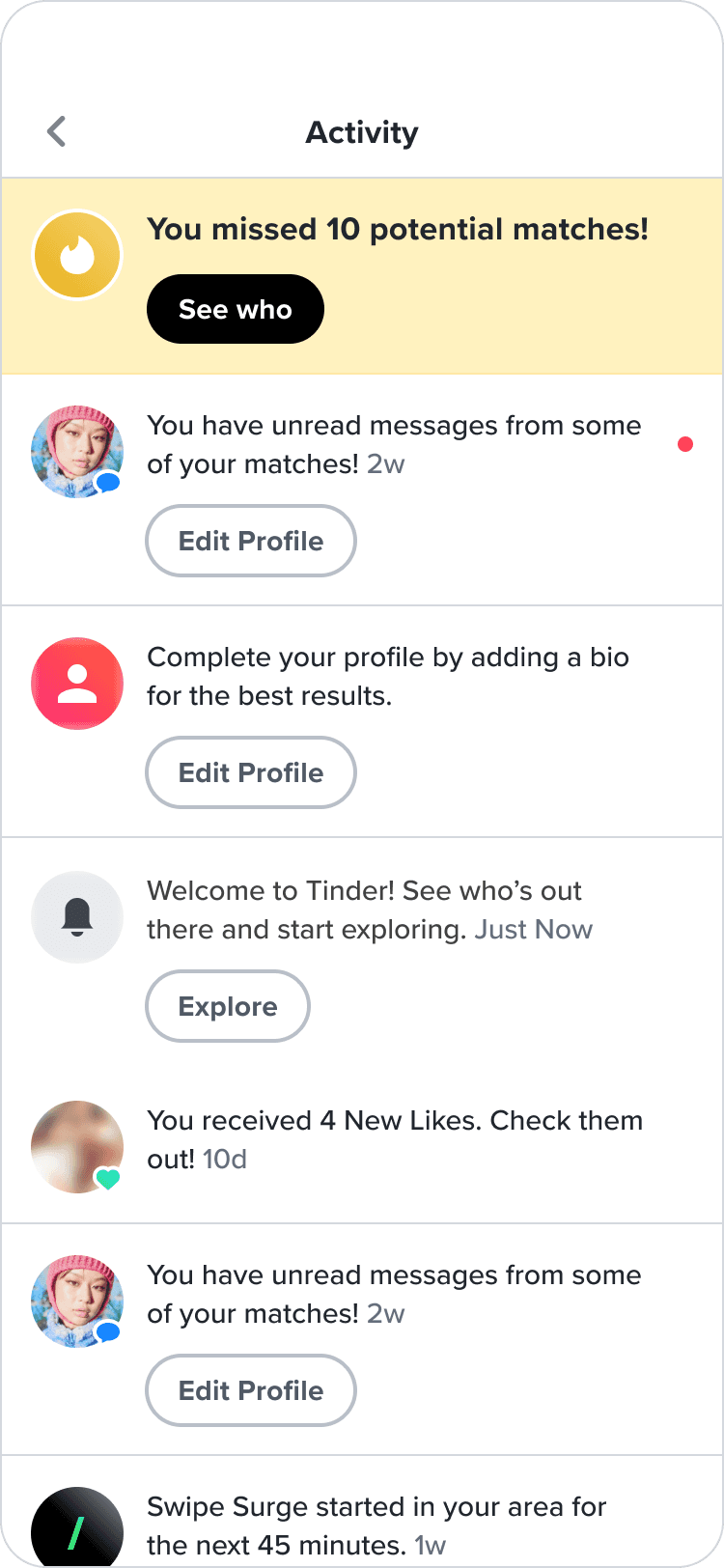
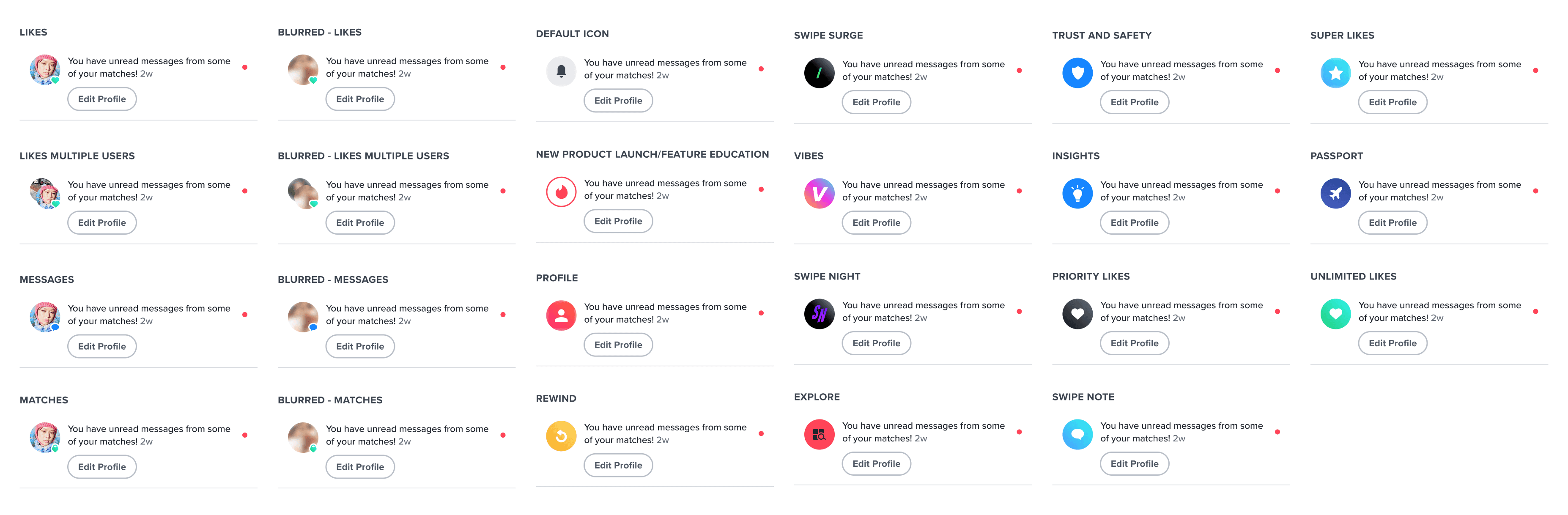
Notification Center
revenue
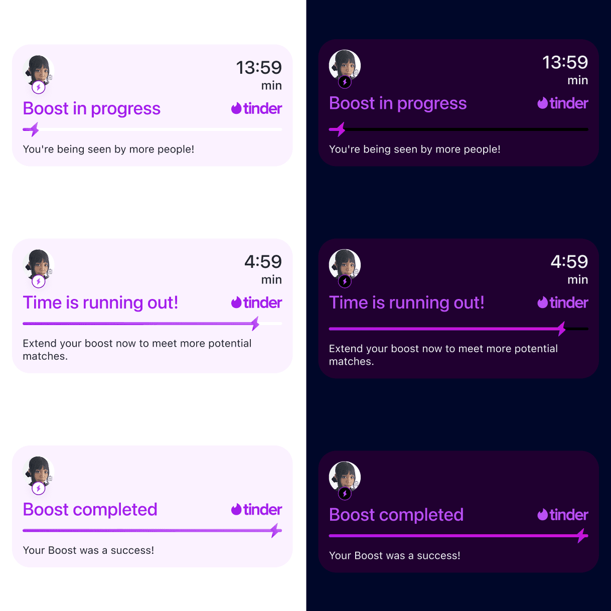
Boost Extension
revenue
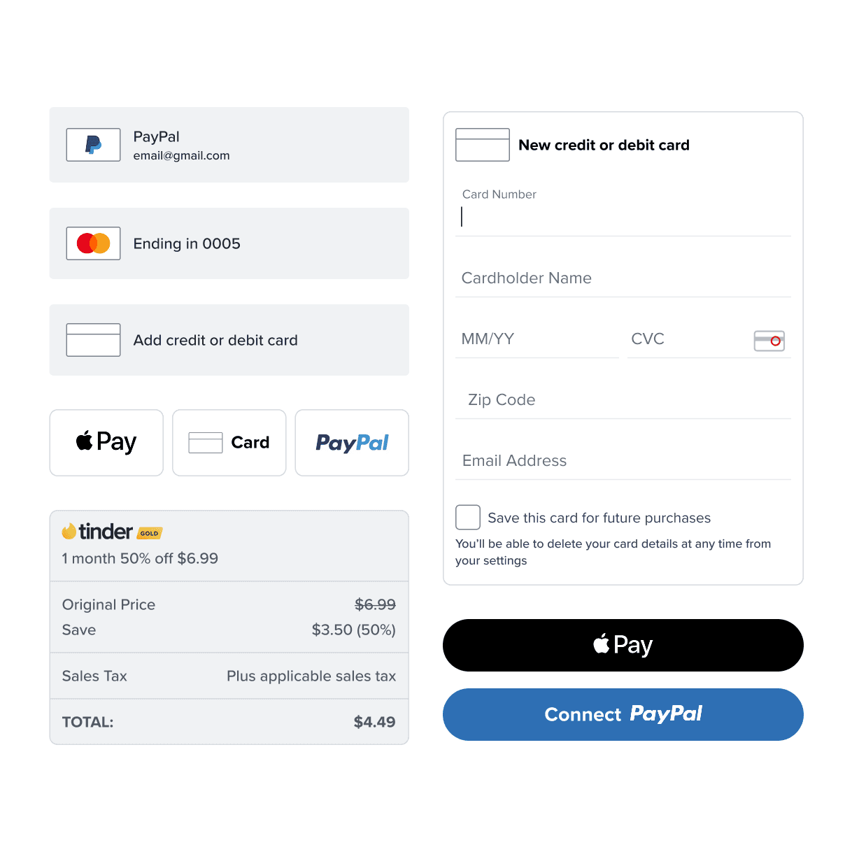
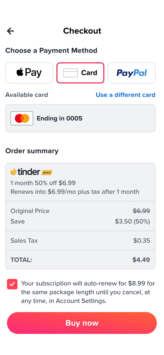
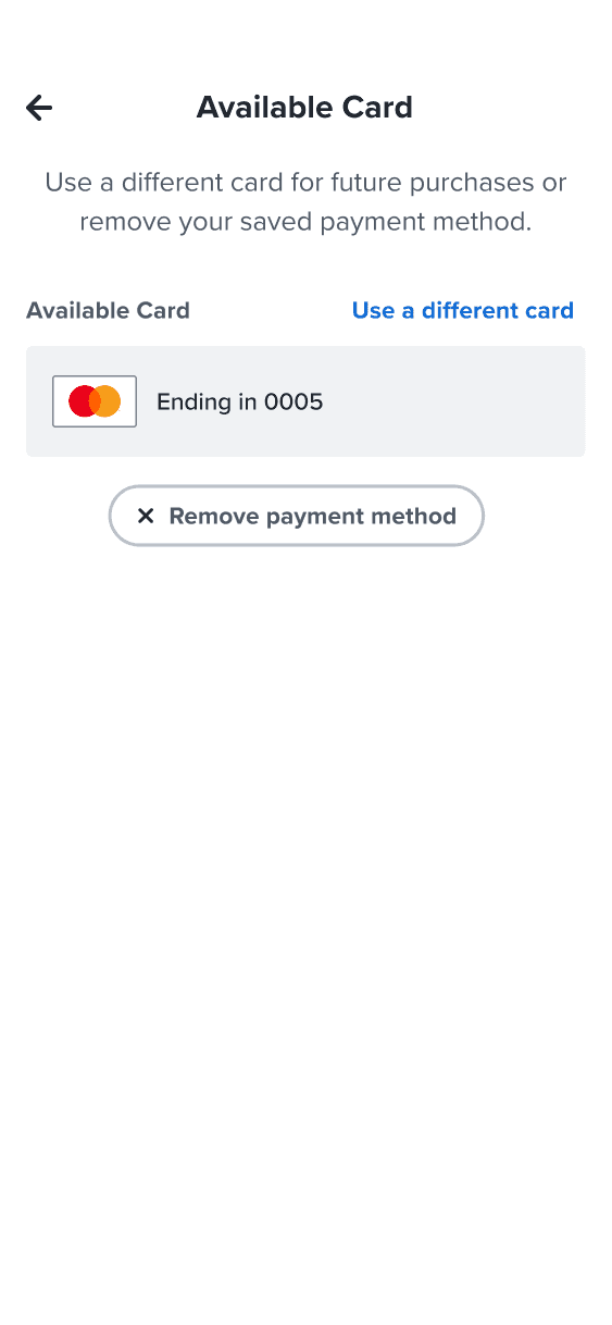
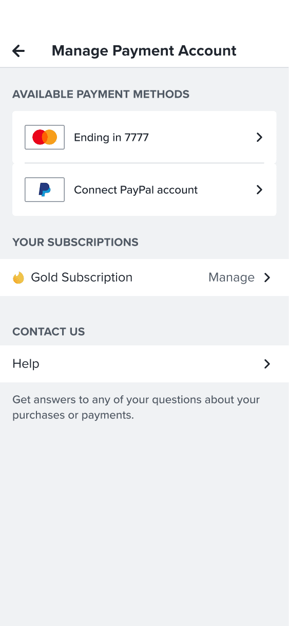
Payment selection and account management