navigation
tinder
gold home
2024
design strategy
design strategy
design strategy
product design
product design
product design
design systems
design systems
design systems
visual design
visual design
visual design
branding
branding
branding
about✐
The Gold Home page is a core screen in Tinder's main navigation that allows non-subscribers to view potential matches they can instantly match with via Tinder Gold. Additionally, it serves as a high-touch surface for our subscribers to match with users that have already liked them.
The page has underperformed for subscription conversion and has seen less matches for our subscribers.
✄impact
Gold Home has repeatedly been Tinder's most impactful surfaces for retention and conversion. This project was an opportunity to redefine the UX for two of Tinder's most important target personas: Non-subscribers and female users.
With respect to brand identity, revenue, and our most important KPI — matches — my team and I were able to re-establish a core Tinder experience for our users.
current gold home experience
current gold home experience
current gold home experience
fully launched
fully launched
fully launched
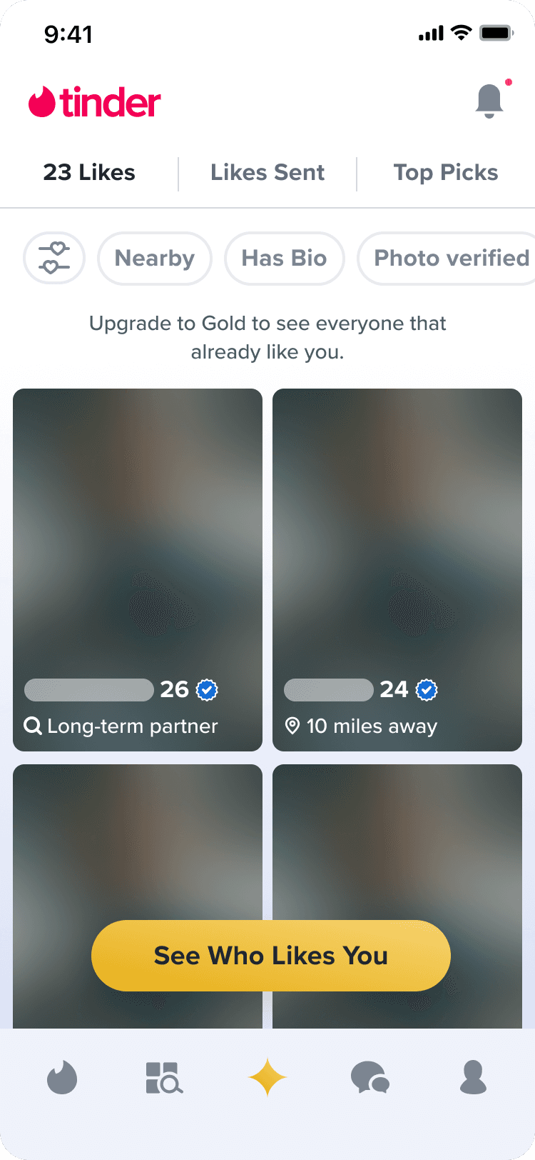
The current Gold Home is a passive, utility focused feed that displays a stagnant grid of profiles.
The current Gold Home is a passive, utility focused feed that displays a stagnant grid of profiles.
A
non-subscriber
This became a low-performing page with little incentive for free users to subscribe.
This became a low-performing page with little incentive for free users to subscribe.
This became a low-performing page with little incentive for free users to subscribe.
B
subscriber
For subscribers, this grid of profiles is a collection of low-quality matches without any organization or emphasis on high-quality matches.
For subscribers, this grid of profiles is a collection of low-quality matches without any organization or emphasis on high-quality matches.
For subscribers, this grid of profiles is a collection of low-quality matches without any organization or emphasis on high-quality matches.
A
non-subscriber
B
subscriber
the solution
Adding a revealed Likes section in Gold Home can emphasize high quality profiles and encourage subscription conversion and retention.
Adding a revealed Likes section in Gold Home can emphasize high quality profiles and encourage subscription conversion and retention.
↳
For our subscribers
↳
For our non-subscribers
↳
Improving the engagement of the Gold Home page through dynamic and contextualized content can add value to our subscription services.
Improving the engagement of the Gold Home page through dynamic and contextualized content can add value to our subscription services.
↳
By revealing high quality profiles to free users, there is more incentive to subscribe in order to match instantly.
By revealing high quality profiles to free users, there is more incentive to subscribe in order to match instantly.
↳
Improving the engagement of the Gold Home page through dynamic and contextualized content can add value to our subscription services.
↳
For our subscribers
↳
By revealing high quality profiles to free users, there is more incentive to subscribe in order to match instantly.
↳
For our non-subscribers
fig 02;design proposal
fig 02;design proposal
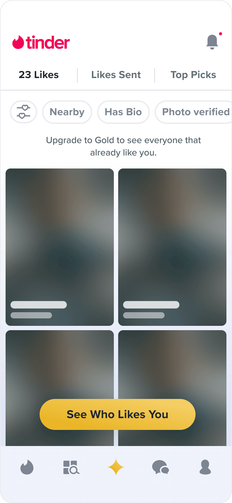
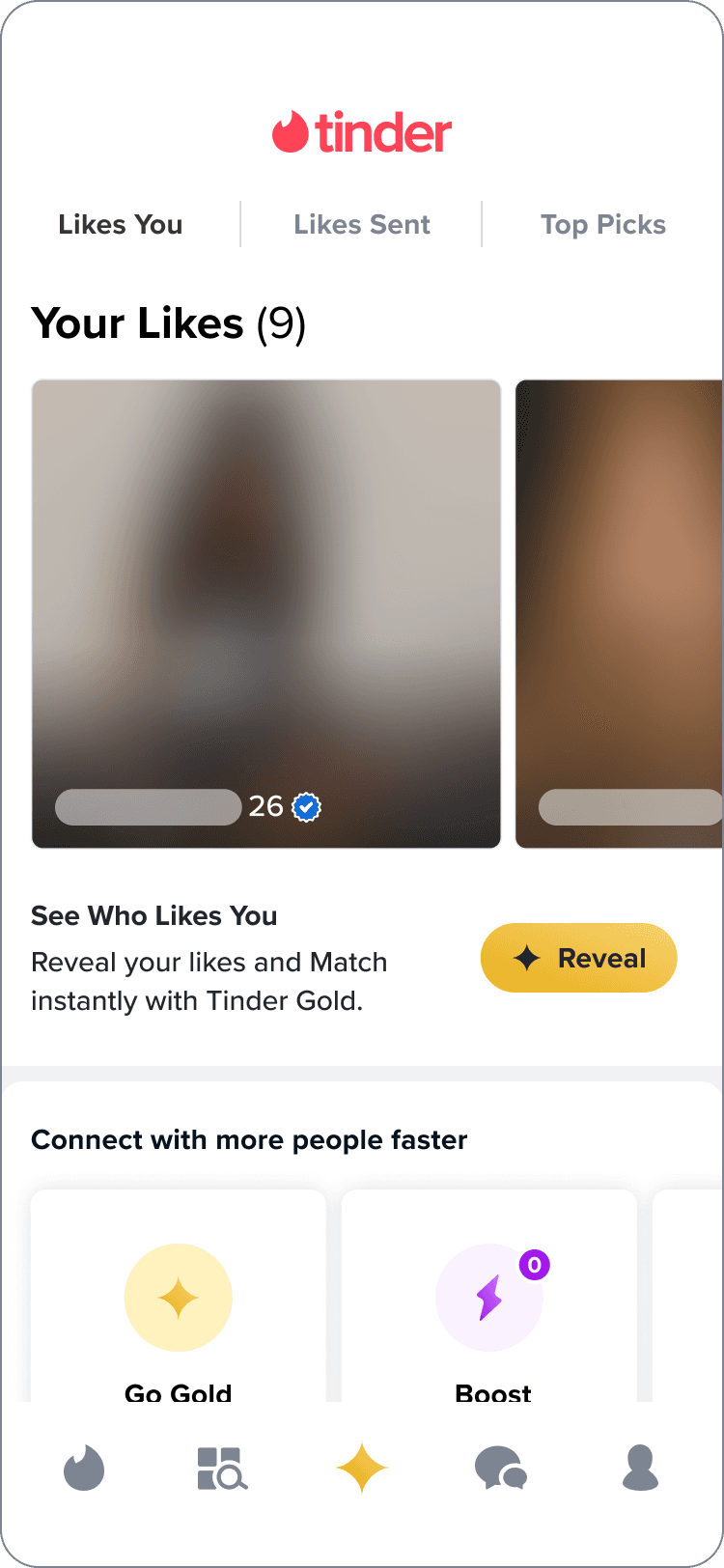
current non-subcriber likes you page
current non-subcriber likes you page
current non-subcriber likes you page
fully launched
fully launched
fully launched
A
The current non-sub experience is a collection of blurred profiles that have Liked you.
The current non-sub experience is a collection of blurred profiles that have Liked you.
The current non-sub experience is a collection of blurred profiles that have Liked you.
B
This view may not provide enough incentive for users to unlock Tinder Gold since the blurred profiles are not enticing or indicative of the types of matches the user could be interested in.
This view may not provide enough incentive for users to unlock Tinder Gold since the blurred profiles are not enticing or indicative of the types of matches the user could be interested in.
This view may not provide enough incentive for users to unlock Tinder Gold since the blurred profiles are not enticing or indicative of the types of matches the user could be interested in.
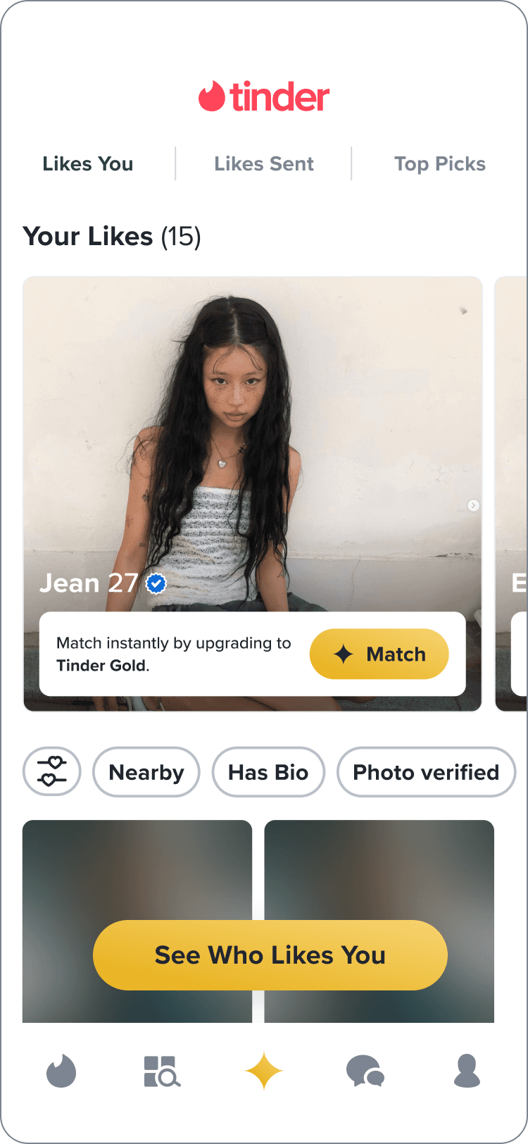
proposed non-subscriber likes you page
proposed non-subscriber likes you page
proposed non-subscriber likes you page
proposed
proposed
proposed
A
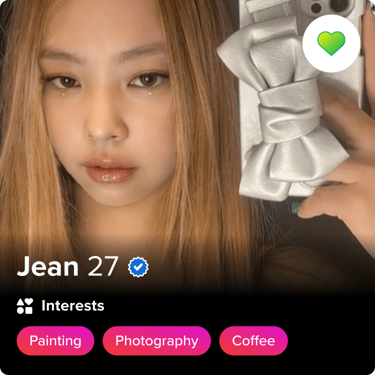
The revealed likes section highlights the top 3 profiles that have Liked you (sorted by popularity).
The revealed likes section highlights the top 3 profiles that have Liked you (sorted by popularity).
The revealed likes section highlights the top 3 profiles that have Liked you (sorted by popularity).
B
These profiles will be unblurred, but users cannot Match instantly without subscribing.
These profiles will be unblurred, but users cannot Match instantly without subscribing.
These profiles will be unblurred, but users cannot Match instantly without subscribing.
C
By showing high quality profiles, users are more likely to upgrade and match instantly.
By showing high quality profiles, users are more likely to upgrade and match instantly.
By showing high quality profiles, users are more likely to upgrade and match instantly.
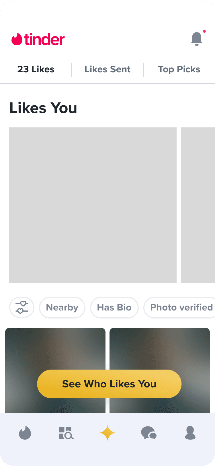
fig 03;layout explorations
fig 03;layout explorations
↪ For the first round of design feedback, I presented three different layout options for the revealed likes section of the Gold Home page.
↪ For the first round of design feedback, I presented three different layout options for the revealed likes section of the Gold Home page.
↪ For the first round of design feedback, I presented three different layout options for the revealed likes section of the Gold Home page.
direction 1
direction 1
direction 1
1
Flippable card stack of profiles
Flippable card stack of profiles
Flippable card stack of profiles
direction 2
direction 2
direction 2
2
Carousel of profiles with UI that matches the rec stack
Carousel of profiles with UI that matches the rec stack
Carousel of profiles with UI that matches the rec stack
direction 3
direction 3
direction 3
3
Carousel of profiles with UI that doesn't resemble the rec stack
Carousel of profiles with UI that doesn't resemble the rec stack
Carousel of profiles with UI that doesn't resemble the rec stack
design feedback; layout explorations
direction 1
feedback
+
Highlights individual profiles well.
+
Could be an ideal layout for subscribers since it indicates that you can swipe left/right on the profile — just like on the rec stack.
-
Doesn't scale for the non-subscriber state because non-paying members will not be able to swipe left/right on the profiles. This means they won't have visibility on the rest of the card stack.
direction 2
feedback
+
Feels the most straightforward when it comes to navigating between the profiles for both free and premium users.
Feels the most straightforward when it comes to navigating between the profiles for both free and premium users.
Feels the most straightforward when it comes to navigating between the profiles for both free and premium users.
+
UI closely matches the rec stack.
UI closely matches the rec stack.
UI closely matches the rec stack.
-
Horizontal carousels usually don’t perform well based on Norman Nielsen UX practices.
Horizontal carousels usually don’t perform well based on Norman Nielsen UX practices.
Horizontal carousels usually don’t perform well based on Norman Nielsen UX practices.
-
Gradient overlay over photo feels more cluttered.
Gradient overlay over photo feels more cluttered.
Gradient overlay over photo feels more cluttered.
direction 3
feedback
+
“There’s something refreshing about bringing in a lighter banner at the bottom of this module. It opens up the space even though we are adding to it.”
“There’s something refreshing about bringing in a lighter banner at the bottom of this module. It opens up the space even though we are adding to it.”
“There’s something refreshing about bringing in a lighter banner at the bottom of this module. It opens up the space even though we are adding to it.”
+
The layout of the cards look different from the more familiar gradient design of the rec stack, indicating that these profiles are "special" because they've already liked you.
The layout of the cards look different from the more familiar gradient design of the rec stack, indicating that these profiles are "special" because they've already liked you.
The layout of the cards look different from the more familiar gradient design of the rec stack, indicating that these profiles are "special" because they've already liked you.
fig 04;button explorations
fig 04;button explorations
↪ I also presented two different options for the button design that will be shown on each profile of the revealed likes section.
Like button
Like button
Like button
+
+
“I like the usage of the like button here. It’s familiar to the user of what this button means and it’s a bit refreshing to see it repurposed this way.”
“I like the usage of the like button here. It’s familiar to the user of what this button means and it’s a bit refreshing to see it repurposed this way.”
“I like the usage of the like button here. It’s familiar to the user of what this button means and it’s a bit refreshing to see it repurposed this way.”
“I like the usage of the like button here. It’s familiar to the user of what this button means and it’s a bit refreshing to see it repurposed this way.”
-
-
For a non-sub, this option seems like it could mislead users into thinking they’re going to match right away. It could be frustrating if they tap the CTA and see a gold paywall.
For a non-sub, this option seems like it could mislead users into thinking they’re going to match right away. It could be frustrating if they tap the CTA and see a gold paywall.
For a non-sub, this option seems like it could mislead users into thinking they’re going to match right away. It could be frustrating if they tap the CTA and see a gold paywall.
For a non-sub, this option seems like it could mislead users into thinking they’re going to match right away. It could be frustrating if they tap the CTA and see a gold paywall.
-
-
The branding of this button does not feel as linked to Tinder Gold.
The branding of this button does not feel as linked to Tinder Gold.
The branding of this button does not feel as linked to Tinder Gold.
The branding of this button does not feel as linked to Tinder Gold.
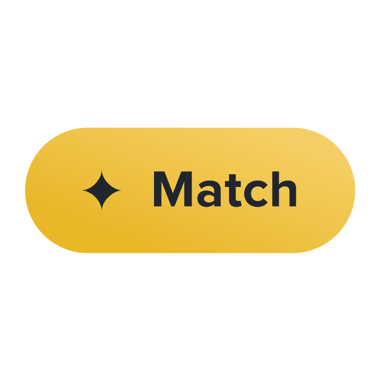
Match button
Match button
Match button
+
+
“I like how explicit this button is. It's saying exactly what would happen if user tapped on it. Liking back would mean that they’ve matched, so using specifically “match” feels enticing.”
“I like how explicit this button is. It's saying exactly what would happen if user tapped on it. Liking back would mean that they’ve matched, so using specifically “match” feels enticing.”
“I like how explicit this button is. It's saying exactly what would happen if user tapped on it. Liking back would mean that they’ve matched, so using specifically “match” feels enticing.”
“I like how explicit this button is. It's saying exactly what would happen if user tapped on it. Liking back would mean that they’ve matched, so using specifically “match” feels enticing.”
+
+
This button is more indicative of an upsell than the usual Like button.
This button is more indicative of an upsell than the usual Like button.
This button is more indicative of an upsell than the usual Like button.
This button is more indicative of an upsell than the usual Like button.
-
-
This button can feel disconnected from the Like branding that users are familiar with.
This button can feel disconnected from the Like branding that users are familiar with.
This button can feel disconnected from the Like branding that users are familiar with.
This button can feel disconnected from the Like branding that users are familiar with.
revealed likes carousel
revealed likes carousel
revealed likes carousel
final designs
final designs
final designs
Layout
Layout
Layout
The final designs were a result of identifying and incorporating the highest performing elements of each iteration. Ultimately combining the most successful carousel and upsell banner explorations.
The final designs were a result of identifying and incorporating the highest performing elements of each iteration. Ultimately combining the most successful carousel and upsell banner explorations.
The final designs were a result of identifying and incorporating the highest performing elements of each iteration. Ultimately combining the most successful carousel and upsell banner explorations.
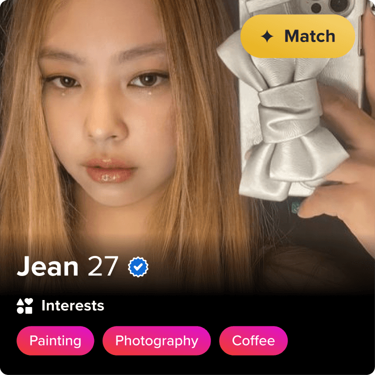
Button
Button
Button
The CTA uses the same iconography and color as the Tinder Gold branding to indicate that this button is more powerful than sending a like.
The explainer text next to the CTA indicates that clicking “Match” will open a paywall.
The CTA uses the same iconography and color as the Tinder Gold branding to indicate that this button is more powerful than sending a like.
The explainer text next to the CTA indicates that clicking “Match” will open a paywall.
The CTA uses the same iconography and color as the Tinder Gold branding to indicate that this button is more powerful than sending a like.
The explainer text next to the CTA indicates that clicking “Match” will open a paywall.
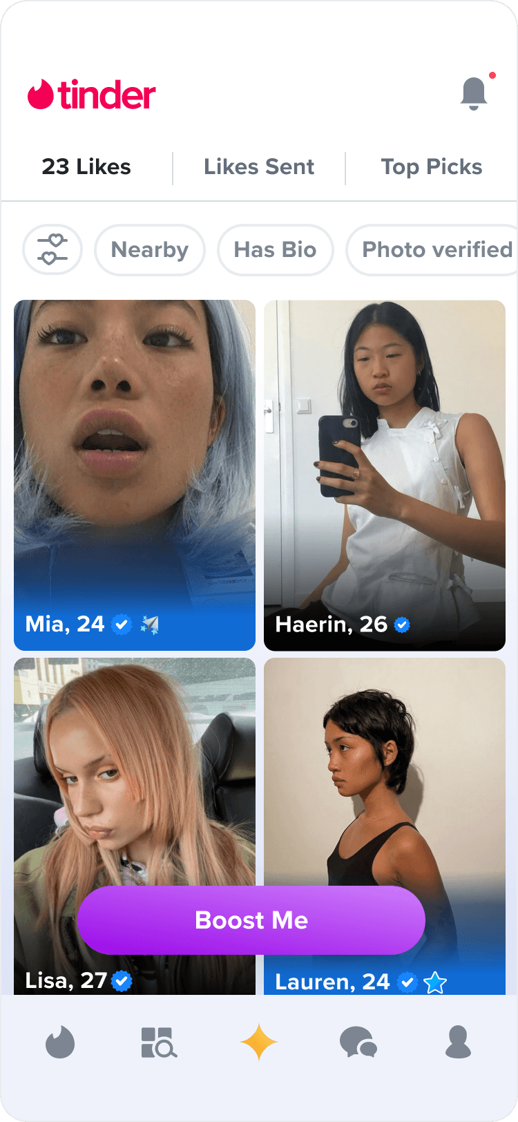
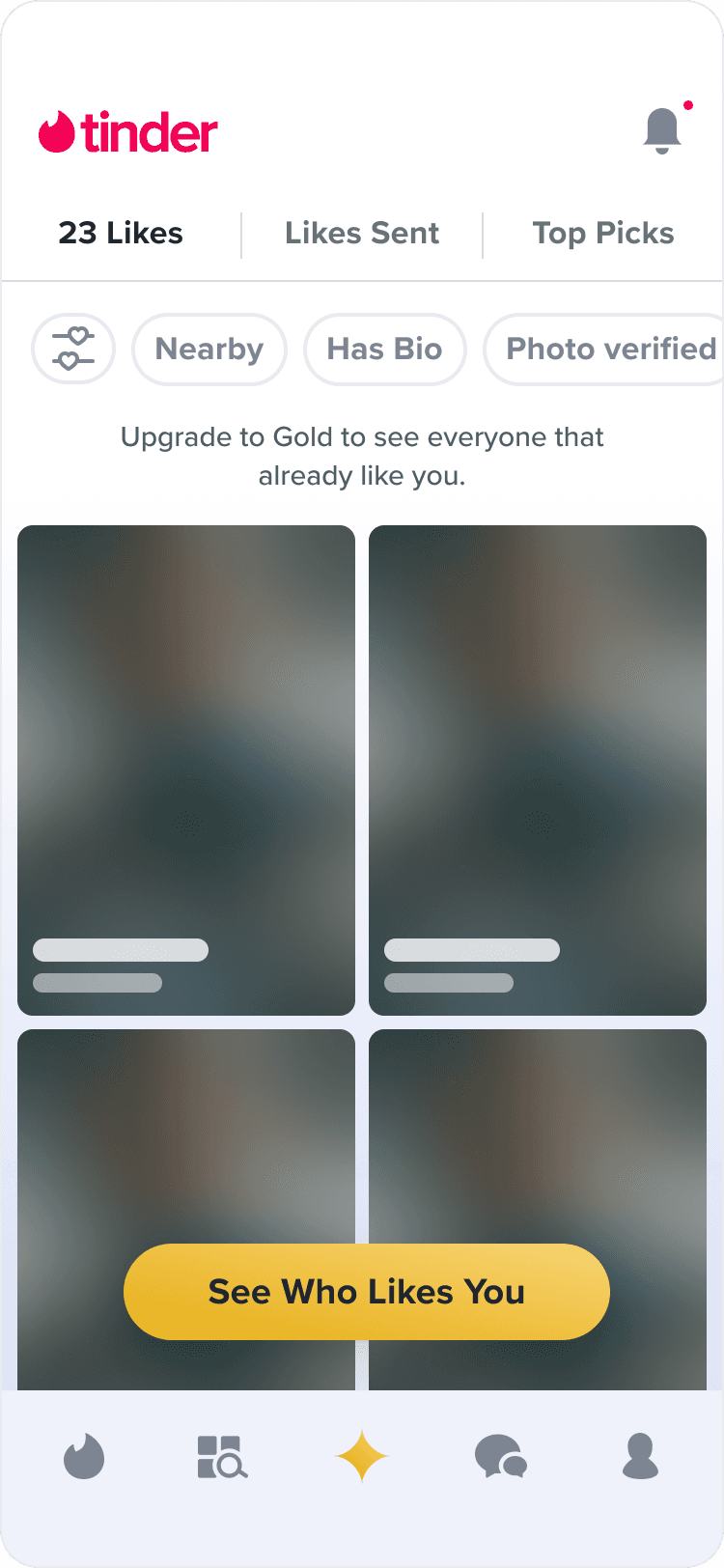
non-subscriber - low likes
non-subscriber - low likes
non-subscriber - low likes
All of the user's likes are blurred and showcased in the carousel.
All of the user's likes are blurred and showcased in the carousel.
All of the user's likes are blurred and showcased in the carousel.
non-subscriber - high likes
non-subscriber - high likes
non-subscriber - high likes
3 profiles are revealed and unblurred, but users are unable to match until they subscribe.
3 profiles are revealed and unblurred, but users are unable to match until they subscribe.
3 profiles are revealed and unblurred, but users are unable to match until they subscribe.
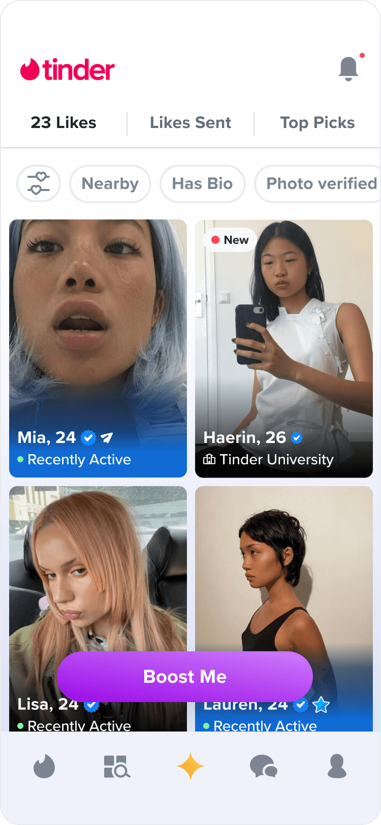
subscriber
subscriber
subscriber
Subscribers are able to directly match within the carousel and all profiles are revealed.
Subscribers are able to directly match within the carousel and all profiles are revealed.
Subscribers are able to directly match within the carousel and all profiles are revealed.
With the profiles on Gold Home, we also wanted to show 'green flags' for each user that has sent a like.
With the profiles on Gold Home, we also wanted to show 'green flags' for each user that has sent a like.
A
non-subscriber
Green flags provide incentives for users to upgrade regardless of the blurred photos.
Green flags provide incentives for users to upgrade regardless of the blurred photos.
Green flags provide incentives for users to upgrade regardless of the blurred photos.
B
subscriber
For subscribers, the exposed green flag provides more organization to the repetitive grid of profiles. It can increase efficiency for finding new matches and provide more user value to the subscription.
For subscribers, the exposed green flag provides more organization to the repetitive grid of profiles. It can increase efficiency for finding new matches and provide more user value to the subscription.
For subscribers, the exposed green flag provides more organization to the repetitive grid of profiles. It can increase efficiency for finding new matches and provide more user value to the subscription.
before (non-sub)
before (non-sub)
after (non-sub)
before (sub)

after (sub)